Design Philosophy

Wednesday, November 16, 2011

Gregory Bath Project


This project was somewhat a challenge for me. Having to follow guidelines for wheelchair accessible appliances in the bathroom. Relating the materials to my art piece was not hard, the hard part was to find most of the materials on the Daltile site. I used a nude colored floor tile to represent the body, Slate as the walls of the shower to represent the colors in the piece, and the pink orange color to represent the color of the pomegranate. The perspectives did not turn out as good as I wanted them to be. but I think I did a good job with the elevations and floorplan. Organizing it all on the poster was hard until we met up together and talked about what we could do to make the poster look better. I like my final outcome.

Gregory kitchen Project


This was the first project our class had to do concerning the Gregory family apartment in the combine building downtown Pullman. The most challenging part for this project was all the accessible requirements for the height of kitchen counters or sink etc. I ended up having 3 different sections where two of them were normal height and the other section was for wheelchair accesibility, it relates to my concept model and the accordeon piece I had in it that were different levels. This project took a while to do since I seemed to always have troubles with the pillars that are in the building that we cant move. I ended up covering them with a wall for the pantry and the other one in a corner.

Sunday, October 16, 2011

Wheelchair exercise


For our studio class, we had to spend about an hour in a wheelchair and go to different buildings and areas and see how disabled people see the world and what were some issues that we had. In this picture Whitney was trying to get into the so called "accesible toilet" but it seemed impossible for a wheelchair to turn around or even get in the stall since a trash can was in the middle of the way and the space outside the stalls was minimal. Riding in the wheelchair I noticed that it takes a lot of practice to be able to turn, stop, and navigate in a wheelchair. Another interesting thing that I learned was that it was harder to roll and control the chair on carpet. This experience made me realize how important it is to have those ADA requirements in public places.

Wednesday, October 12, 2011

St. Ignatius Chapel sketch


This church was so interesting to look at inside and outside. I think my favorite part of it was the tree and the lamp attached to it. I also tought the door was very unusual and interesting. I liked how there was a small door and a big one for the entrance and how people have to bow down to get in the church. The colors coming out into the walls in the middle of the church was so beautiful to look at. And the shape of the interior with all the curves made it seem like a sea. I would think it would make it feel more enclosed but they made it so it didnt make it tight. It still felt open and airy. My sketch shows the light and the curves of the church.

Tuesday, October 11, 2011

Seattle Job Shadow


For our Seattle field trip, I signed up to job shadow an interior Designer that works with yatch companies either to work with a client that already owns a boat or to make a boat sell. We went to tacoma, WA to look at the actual constructions of the yatchs at Nordlund. It was so interesting to see how complicated it is to build a home in a boat. All the measurements are complicated and custom fitted to the shape of the boat. For example the walls are curved in a boat so they have to order a custom sofa to fit right against the wall of the boat. We also saw the very begining of a boat construction which was just the bottom base of the boat and the top of it was on the side being built, I learned that you have to flip to top part of the boat on the bottom part. It just all looked so complicated. I heard that some of their boats take 4 years to completely finish. You need a lot of patience to have this job. We got to see all of their plans elevations and more in their a least 40 page packet for one of their boats.
We also went to Ocean Alexander in Seattle, Wa they sell yatchs. We got to go on a finished on that cost 5 million dollars which was amazing. The interior looked so cozy and private. There were 2 seperate entrances one for the owner, family guests, and the other for the crew. I was so excited just to be inside of the boat. It looked so beautiful. Although I don't think any of the boats we saw could ever be accesible for people in wheelchair. The master bedroom was my favorite room, it had a huge bed, two seperate closests, tv, bench, his and hers sink and toilet and the shower between. There was 3 levels on that boat. The top part was outside bar area, wheel, and hot tub. It looked perfect for me if I was rich. Overall good experience, the ladies talking to us were very nice and explained to us many things if we had questions.

Spokane expo

Going to this expo was interesting. I got to meet designers from different backgrounds and different materials that they worked with along with their company. I was surprised by how many of the spokepersons knew about our interior Design program in WSU. Most of the designers took their time to talk to us about their products and some of them even offered to give us free samples. They were very passionate about what they did. I noticed how every company in their were focusing on being Green giving out tote bags that replaced the plastic bags that so many people use each day to throw away in the trash after using them for a couple minutes to carry goceries. These bags end up in the oceans and are harmful to our planet and all the living things on it. I thought the expo was going to be bigger overall with a lot more people but it was enough to learn something new.

Wednesday, September 7, 2011

Psychology of home

This project was a research project we did about the Psychology of "Home". For example, why we feel the way we do in a dark room and how comfortable we feel in a specific space. We also had to include 2 case studies and mine is about a brand new hospice for terminally ill children that made them feel more comfortable with their parents close and the interior feel like home. I learned a lot researching this topic.

Friday, July 29, 2011

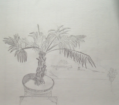
Outside layers


This sketch was done outside on the campus of WSU in Pullman. The goal for this sketch was to get three layers of distance which turned out to be harder than I thought to do. I do love how my plant turned out and spent most of the time sketching it since it was the closest layer. As things move back they become more blurry.

Banana


This is a cross section of a banana and I do like this one but am not used to this kind of sketching and did not really know what I was suppose to do, but I did it right and I think it looks interesting

Chairs


In this sketch, I had to draw the negative space of the chairs. I thought the chair on the right was harder since it had more parts and more detail to it. The chair on the left was easier and I love how it came out.

Upside down drawing


This was one of my favorite sketches that I did during the summer. Looking at this image upside down and trying to draw it was interesting. Your eye does not look for features that are recognizable, they look at the lines and how they connect and cross. Although the head of this drawing is out of proportion it still looks good. I will remember to draw some things upside down sometime.

Textile Pattern

As an idea generator for this textile piece was the historical period of Victorian Revival. Elements used from this historical inspiration were the repeated flower wallpapaers, the classic checker board tile was in use for flooring at the base of their spiral staircases. Claw feet were often used for support of bath tubs or chair during this time. Composing this textile with the old frame and picture in the middle represents Victorian Revival because these frames were almost always the focal point of a side table in the house. Putting the claw feet on the sides made it looks like it was supporting the picture frame having the same color and texture. Flowers in the background always occured in Victorian Houses using them as wallpaper. I am pleased with this final outcome although it came out a different color with the plotter.

Reflection on bench project

This project when first introduced to us seemed overwhelming and lots of work with a limited time to get it done. Once we started the project with our objects things started to just flow. We helped each other and the teachers also gave us some advice. I am not the most organized person out there but this project helped me to get organized and get stuff done. For me some of the problems I had was sketching out my ideas. I rather build things and see if I like it or if I need to do something to make it better, etc. Building the actual bench was a pain since I have different materials and plastic is not very glueable, but I made it stick somehow. I figured out that my bench was top heavy so had to add a side wall so the bench could stay up and it turned out to be nicer with it. The posters that I made seemed somewhat empty, but everything that I needed was on there. I learned a lot from this project.

Thursday, July 28, 2011

Technical poster


This last poster is the technical part of the process. All measurements and scales, and materials are on this poster. I mounted the sketchs on foam core so they appeared to pop out of the poster.

Aesthetics Poster


In this second poster, I put my rendered sketch, my light studies of my bench model, and the materials I plan to use and where to use them.

Process Poster


This poster was one out of the three posters I had to do for my final project. It is the process of my thinking, and how I got the ideas for my final bench model. The found object was probably the main source of my thinking. But Candice Olson's quote also helped me with her words. I built plenty of process models to help me think of improvements and lead me to the final concept model with is in the middle right of this poster. My concept statement describes the idea generator, form-givers and application.

Final Bench Design


This is my final bench model created in ID 103 during this summer. I am very pleased with how it turned out. I had some issues with the different materials I used and to make them stay together and glued, but I made it. I decided to use some clear plastic in this design to let light in at all times. There are also lights at the top of the bench so if it is dark outside you can still have some type of lighting going on. This bench is for the outdoors and relaxing. I would love to have this bench outside of my own place. Wouldn't you like it outside your place?

Found Object


In ID 103, our class had to go on a hunt for an "interesting" object that we find in our paths. This object was found in a demolition site near my residence hall McEachern. I am not quite sure what it is or what it is used for, but it looks like it can be crewed in since it has indentations at the end. With this object, we had to come up with abstract drawings inspired by it somehow. At the end, we had to choose 3 out of 50 little drawings to be our "parti' drawings. From our Parti drawings we had to create a bench using the elements and principles of design that were in our Parti.

Friday, July 1, 2011

Hands


This art piece was made with black ink and a bamboo stick. I positioned my hands in different ways and arranged them on the page. I did drop some ink spots on the paper but thought it would add more to the negative space in the piece to make it look more interesting. The hand on the bottom right, is my favorite because my hand actually looks like this when I push on the table with my thumb. Creepy, but awesome.

Jack in the Santa hands


This painting idea came from some doodles that I made on my school notebooks. I do not know where these ideas come from, but I love it. The actual piece is brighter than what the photo shows. One of my other favorites.

Chicken


This painting was made in Art Studio at Timberline High School in 2009. I absolutely love this piece and am proud of it. It is a 36 by 36 canvas and made with acrylic paint. This painting took me about a week to completely finish it. I used a primary color scheme and made texture with different brushes and strokes. I will let you know that the chicken is my favorite animal and this was my first try to paint one. Comments are always welcome!

Modern Mater


This image was made by using a original palouse picture and having fun with it in Illustrator. I found this old truck picture and immediately thought of Tow Mater from the Pixar movie "Cars". This was my first try in Illustrator. I am sure I can do better with more experience.

Thursday, June 30, 2011

Candice Olson Poster


For ID 103, we had to do some information gathering on a designer/artist/architect and I chose Candice Olson as my Interior Designer. I found her designs to be peaceful but still interesting to the eye. She is also on HGTV in Divine Design and Design Star host. Creating this poster, I used contrast, repetition, and balance. I found the result very likeable and interesting to look at. If you have any feedback please let me know it would help me being a brand new student in the Interior Design Program at WSU.

Pattern Block


This pattern blog was made by using 7 different images and distorting the original images into something completely different. I am pleased by how it turned out, but had some trouble making it fit excatly so it looked symmetrical since my template had some faults. This took me about 4 hours to finish. I would love to get some feedback on this one, please leave some comments for me. Thank you